Latest business intelligence tools provide many unique ways to present data, and some of them are quite different from the normal bar graph and pie charts which we commonly use. To list a few:
- Timeline
- Gantt chart
- Scatter Plot
- Pie chart/Bar chart
- Tree Map
- Bubble Chart
In this blog I have tried to explore and analyze 3 business vignettes and the best data visualization approach for them.
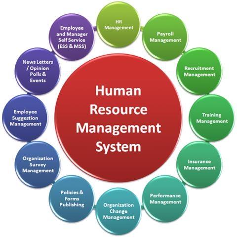
Human Resource Management (HRM)
Visualization method: Timeline, it can be prepared using tools such as Excel, Timeline JS, Timeflow
 |
| http://managementpillors.blogspot.com/p/hrm.html |
Human Resource Management system main objective is to let the organization better understand its employees, their demographics, skills, earnings, and performance to maximize employee utilization. Apart from payroll management, some of the primary employee related processes capture information via accumulated snapshots. For example, initiating an employee recruitment process, starting appraisal process, tracking job role history of an employees.
The timeline provides best method to depict such processes. In the timeline, time dimension forms as our progress bar over which facts are captured as they get accumulated over time. Taking example of appraisal process, it has various phases, appraisal initiation, review, evaluation, and acceptance. Timeline would provide best visualization for such process.
Customer Relationship Management (CRM)
Visualization method: Bar graph combined with line chart, since it is a very popular ways of showing data, it is available in every BI tool.
CRM provides a Customer centric model to better understand customer behavior and their relation with the organization. It entails all focusing all aspects of business, from marketing, sales, operations, service to ensure a mutually beneficial relation. Different organizations may have different view of customer depending on the business function, the primary goal however remains same i.e. to identify opportunities, filter out the prospective customers, and finally the business starts when customer converts into a company account.
Once the business starts, the organization is then interested to know what the lifetime value of the customer is, and how lucrative the business has been.
The bar graph view combined with line chart provides the optimum clarity regarding the data being presented, when it comes to revenue. We can easily view the revenue generated by various customer, combined line charts can be used to combine any other dimensional parameter.
In the below figure its shows the estimated revenue per customer, whereas the bar graph shows the actual revenue generated. In some other scenario, we may use this combination to compare previous year’s revenue with the current year’s revenue. It proves to be visually more effective than using only bar graphs or on line charts in a graph for the comparison parameters.

Electronic Commerce
Visualization Method: Funnel Chart, available in Tableau, OBIEE
The electronic commerce is much more than buying and selling online as what might me a general perception. Web analytics is now used to record gesture of every web visitor. A number of dimensions come into picture such as page, session, referrer, and visitor origin, which are not found in other data and that’s the reason I have chosen this vignette.
Interestingly there are many unique ways of viewing such a data. Mostly, the websites owners are interested in viewing the visitor demographics, activities they performed, how deep they checked out the functionality of the website, and whether or not they made a purchase. This data is valued so that it can be analyzed for bottlenecks in the website and can be used for formulating marketing strategy.
Funnel Chart:

A funnel provides a pictorial representation of customer activities and is easy to comprehend. Looking at the funnel one can identify the activities which are most popular with the visitors and where do the customers leave the site. This is shown in the left image. The second image shows the count of customers who started the purchase process by adding it to the cart and how many out of them actually made the purchase. Combined with a tabular data showing various parameters and their values, this view can be really effective.
References:
1. Data Warehouse Toolkit – The definitive Guide to Dimensional Modelling- 3rd Edition by Ralph Kimball and Margy Ross
No comments:
Post a Comment